Through a grid's FixedHeaders and FixedFooters collections, specialty rows and controls (e.g., InsertionRow and GroupByControl classes) as well as any other UIElement can be displayed in the fixed (i.e., non-scrolling) sections located above and below the displayed data.
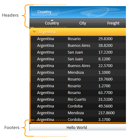
By default, a group-by control (see GroupByControl class) and a column-manager row (see ColumnManagerRow class) are located in a grid's fixed headers section. Through the DefaultHeaderFooters property, the elements that are displayed by default can be modified. In order to remove the default headers, the UseDefaultHeaderFooters property must be set to false.
 |
When the UseDefaultHeadersFooters property is set to false, all default items contained in the header and footer sections will be removed. This includes the ColumnManagerRow, whose cells are used as column headers (see ColumnManagerCell class) and through which the items in a grid can be sorted, reordered, grouped, etc. |
<sldg:DataGridControl x:Name="sldgDataGridControl"
                      ItemsSource="{Binding Path=Orders}"
                      DefaultHeadersFooters="ColumnManagerRow, InsertionRow, NotificationControl">
   <sldg:DataGridControl.FixedFooters>
       <Button Content="Hello World"/>
   </sldg:DataGridControl.FixedFooters>
</sldg:DataGridControl>
Group Headers and Footers
The DataGridGroupConfiguration class exposes a collection of fixed and non-fixed (i.e., scrolling) headers and footers (see Headers, Footers, FixedHeaders, and FixedFooters properties), which represent the elements that are displayed in the headers and/or footers of every group to which the configuration is applied. Each element that is added to either collection must be added as a DataTemplate.
 |
Elements contained in the fixed header or footer sections of a group will remain visible when the containing group is collapsed. |
Each element in a group header or footer has a GroupContext, which exposes context-specific information for that element, and which is accessible through a RelativeSource the DataGridControl.GroupContext attached property. The GroupDescription property provides access to the DataGridGroupDescription that was used to create the groups, the GroupPath property exposes the DataGridPath, which represents the location of the group in a grid, while the GroupValue property exposes the group's value (e.g., "Canada", "France"). The IsBottomLevel property indicates whether the group is part of the bottom (i.e., last) level groups while the Items, ItemCount, and IsItemCountEstimated properties provide various information about the items contained in the group and their count.
|
The Items and ItemCount properties will always return null (Nothing in Visual Basic) and the IsItemCountEstimated property will always return false when the grid is bound to a virtualized data source. |
|
The GroupContext attached property will only be set on the first (i.e., root) element in the DataTemplate and can be accessed through a RelativeSource binding using the Self mode (see examples example below). Any child elements in the template can access the parent's GroupContext through an ElementName binding. For example: <TextBlock Text="{Binding ElementName=parentPanel, Path=(sldg:DataGridControl.GroupContext).GroupValue}" /> |
Dynamically displaying a label in group headers

Adding a control to the fixed footers of a group (select all items in a group)